Tutorial
This tutorial shows source code on how to recreate the first three figures and the sixth figure from the multitaper paper of Prieto. Simple examples for the DPSS method, the Wigner Ville spectrum, and multitaper coherency calculations are included as well. More information can be found in the Prieto paper (reference).
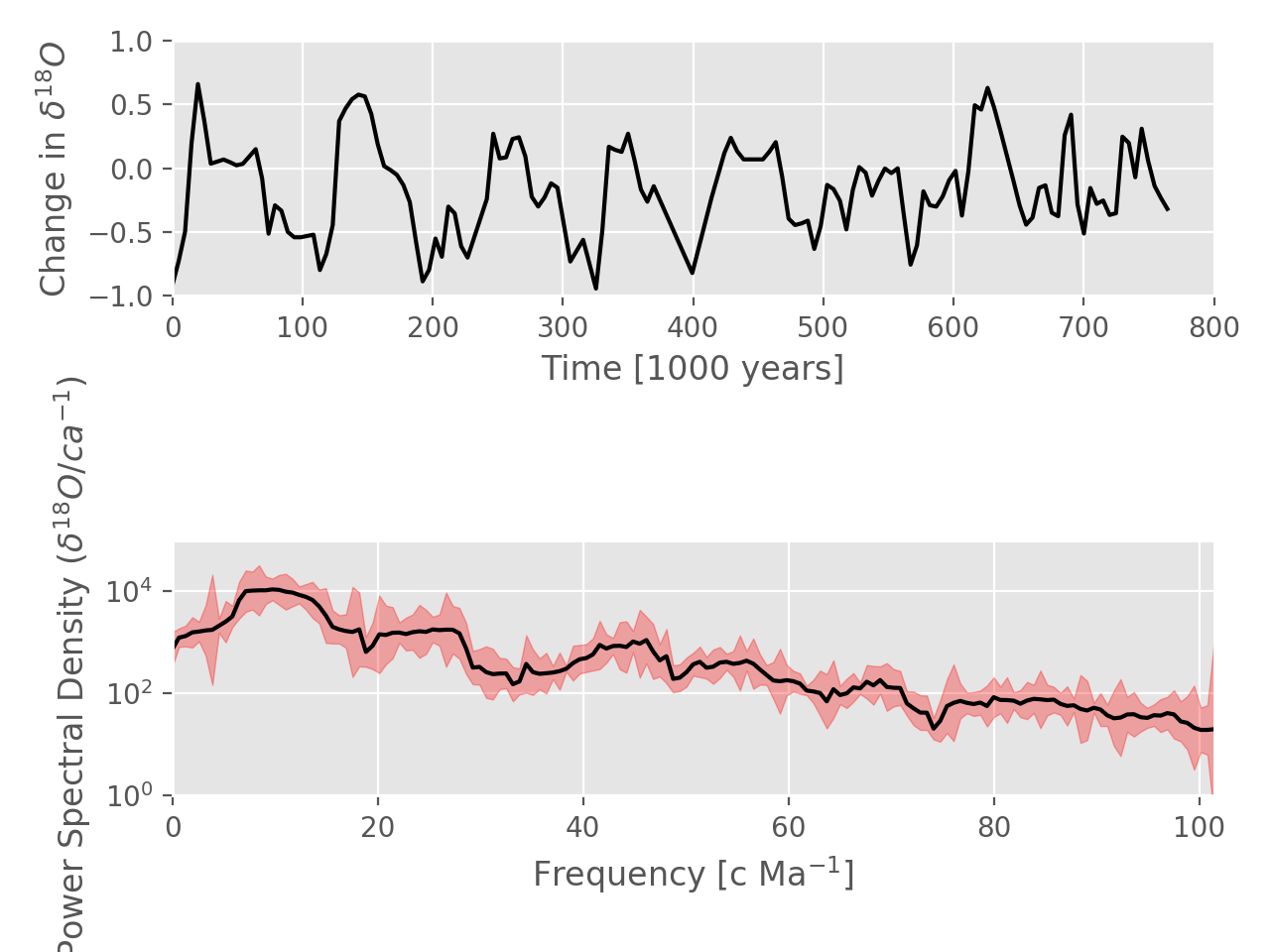
Fig. 1: Multitaper Spectrum Estimate with Confidence Intervals
This example shows data at the top and a multitaper spectrum estimate on the
bottom with 95% confidence intervals shaded in red.
See the documentation of the mtspec.multitaper.mtspec() function for
more details.
(Source code, png, hires.png, pdf)

import matplotlib.pyplot as plt
plt.style.use("ggplot")

import numpy as np

from mtspec import mtspec
from mtspec.util import _load_mtdata

data = _load_mtdata('v22_174_series.dat.gz')

# Calculate the spectral estimation.
spec, freq, jackknife, _, _ = mtspec(
    data=data, delta=4930.0, time_bandwidth=3.5,
    number_of_tapers=5, nfft=312, statistics=True)

fig = plt.figure()
ax1 = fig.add_subplot(2, 1, 1)
# Plot in thousands of years.
ax1.plot(np.arange(len(data)) * 4.930, data, color='black')
ax1.set_xlim(0, 800)
ax1.set_ylim(-1.0, 1.0)
ax1.set_xlabel("Time [1000 years]")
ax1.set_ylabel("Change in $\delta^{18}O$")

ax2 = fig.add_subplot(2, 1, 2)
ax2.set_yscale('log')
# Convert frequency to Ma.
freq *= 1E6
ax2.plot(freq, spec, color='black')
ax2.fill_between(freq, jackknife[:, 0], jackknife[:, 1],
                 color="red", alpha=0.3)
ax2.set_xlim(freq[0], freq[-1])
ax2.set_ylim(0.1E1, 1E5)
ax2.set_xlabel("Frequency [c Ma$^{-1}]$")
ax2.set_ylabel("Power Spectral Density ($\delta^{18}O/ca^{-1}$)")

plt.tight_layout()
plt.show()
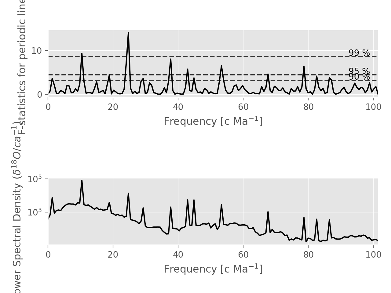
Fig. 2: F Statistics
The top shows the F statistics and the bottom a spectrum reshaped with these.
Function documentation: mtspec.multitaper.mtspec().
(Source code, png, hires.png, pdf)

import matplotlib.pyplot as plt
plt.style.use("ggplot")

import numpy as np

from mtspec import mtspec
from mtspec.util import _load_mtdata

data = _load_mtdata("v22_174_series.dat.gz")
spec, freq, jackknife, fstatistics, _ = mtspec(
    data=data, delta=4930., time_bandwidth=3.5, number_of_tapers=5,
    nfft=312, statistics=True, rshape=0, fcrit=0.9)

# Convert to million years.
freq *= 1E6

plt.subplot(211)
plt.plot(freq, fstatistics, color="black")
plt.xlim(freq[0], freq[-1])
plt.xlabel("Frequency [c Ma$^{-1}]$")
plt.ylabel("F-statistics for periodic lines")

# Plot the confidence intervals.
for p in [90, 95, 99]:
    y = np.percentile(fstatistics, p)
    plt.hlines(y, freq[0], freq[-1], linestyles="--", color="0.2")
    plt.text(x=99, y=y + 0.2, s="%i %%" % p, ha="right")

plt.subplot(212)
plt.semilogy(freq, spec, color="black")
plt.xlim(freq[0], freq[-1])
plt.xlabel("Frequency [c Ma$^{-1}]$")
plt.ylabel("Power Spectral Density ($\delta^{18}O/ca^{-1}$)")

plt.tight_layout()
plt.show()
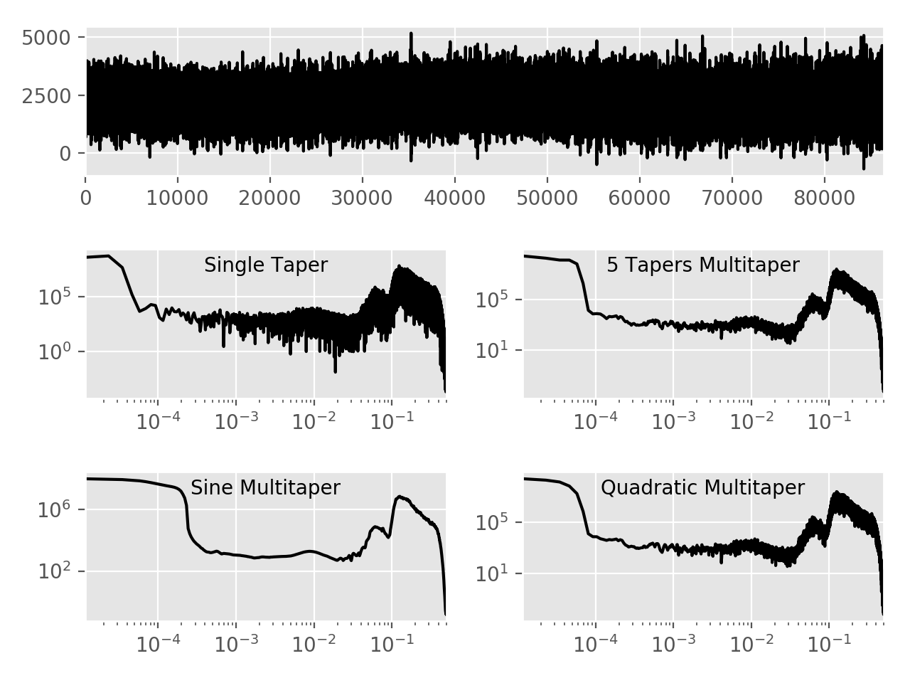
Fig. 3: Various Multitaper Variants
Comparison of different multitaper spectral estimates and various settings.
Top shows data, bottom 4 plots are spectral estimations. Function
documentations: mtspec.multitaper.mtspec() and
mtspec.multitaper.sine_psd().
(Source code, png, hires.png, pdf)

import matplotlib.pyplot as plt
plt.style.use("ggplot")

from mtspec import mtspec, sine_psd
from mtspec.util import _load_mtdata

data = _load_mtdata('PASC.dat.gz')

plt.subplot(311)
plt.plot(data, color='black')
plt.xlim(0, len(data))

spec, freq = mtspec(data, 1.0, 1.5, number_of_tapers=1)

plt.subplot(323)
plt.loglog(freq, spec, color='black')
plt.xlim(freq[0], freq[-1])
plt.text(x=0.5, y=0.85, s="Single Taper",
         transform=plt.gca().transAxes, ha="center")

spec, freq = mtspec(data, 1.0, 4.5, number_of_tapers=5)

plt.subplot(324)
plt.loglog(freq, spec, color='black')
plt.xlim(freq[0], freq[-1])
plt.text(x=0.5, y=0.85, s="5 Tapers Multitaper",
         transform=plt.gca().transAxes, ha="center")

spec, freq = sine_psd(data, 1.0)

plt.subplot(325)
plt.loglog(freq, spec, color='black')
plt.xlim(freq[0], freq[-1])
plt.text(x=0.5, y=0.85, s="Sine Multitaper",
         transform=plt.gca().transAxes, ha="center")

spec, freq = mtspec(data, 1.0, 4.5, number_of_tapers=5,
                    quadratic=True)

plt.subplot(326)
plt.loglog(freq, spec, color='black')
plt.xlim(freq[0], freq[-1])
plt.text(x=0.5, y=0.85, s="Quadratic Multitaper",
         transform=plt.gca().transAxes, ha="center")

plt.tight_layout()
plt.show()
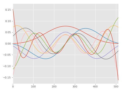
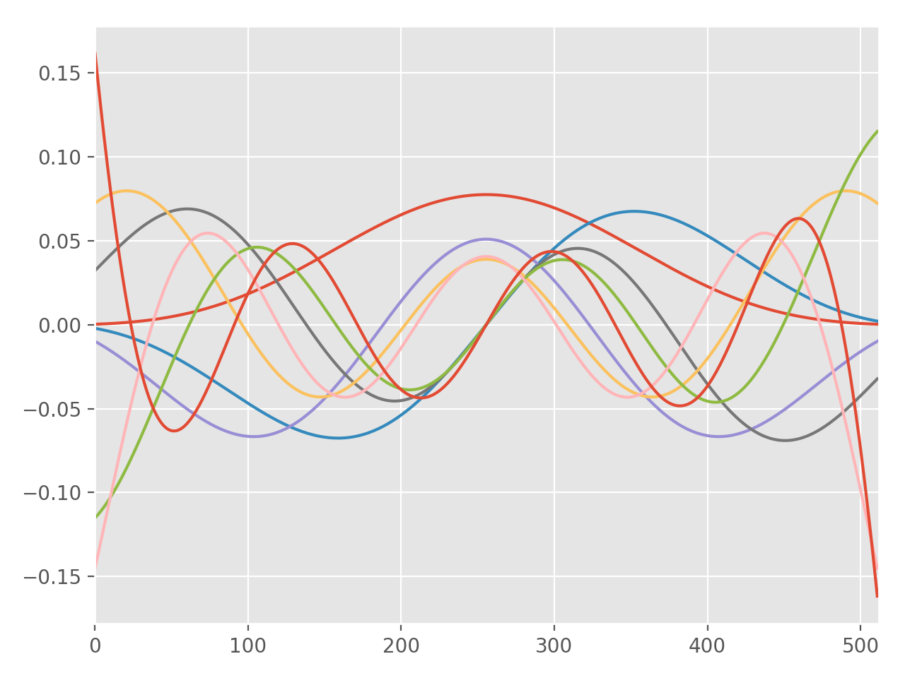
DPSS Example
A simple example showing how to calculate and plot a couple DPSS. Function
documentation: mtspec.multitaper.dpss().
(Source code, png, hires.png, pdf)
import matplotlib.pyplot as plt
plt.style.use("ggplot")

from mtspec import dpss

tapers, _, _ = dpss(npts=512, fw=2.5, number_of_tapers=8)

for i in range(8):
    plt.plot(tapers[:, i])
plt.xlim(0, len(tapers[:, 0]))

plt.tight_layout()
plt.show()
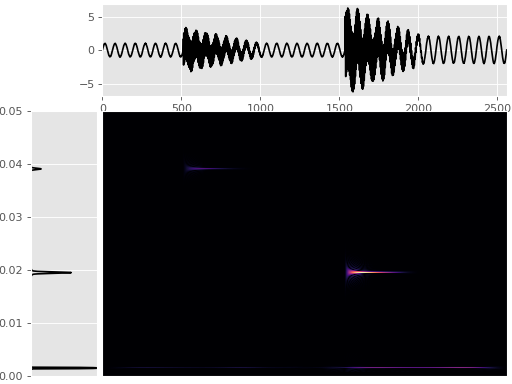
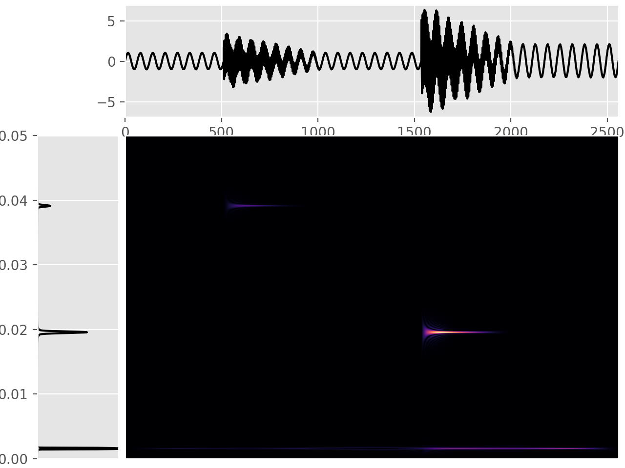
Wigner-Ville Spectrum
Time frequency like spectral estimation using the Wigner-Ville method.
Function documentation: mtspec.multitaper.wigner_ville_spectrum().
(Source code, png, hires.png, pdf)
import matplotlib.pyplot as plt
plt.style.use("ggplot")

from mtspec import mtspec, wigner_ville_spectrum
from mtspec.util import signal_bursts

fig = plt.figure()
data = signal_bursts()

# Plot the data
ax1 = fig.add_axes([0.2,0.75, 0.79, 0.24])
ax1.plot(data, color="k")
ax1.set_xlim(0, len(data))

# Plot multitaper spectrum
ax2 = fig.add_axes([0.06,0.02,0.13,0.69])
spec, freq = mtspec(data, 10, 3.5)
ax2.plot(spec, freq, color="k")
ax2.set_xlim(0, spec.max())
ax2.set_ylim(freq[0], freq[-1])
ax2.set_xticks([])

# Create the wigner ville spectrum
wv = wigner_ville_spectrum(data, 10, 3.5, smoothing_filter='gauss')

# Plot the WV
ax3 = fig.add_axes([0.2, 0.02, 0.79, 0.69])
ax3.set_yticks([])
ax3.set_xticks([])
ax3.imshow(abs(wv), interpolation='nearest', aspect='auto',
           cmap="magma")

plt.show()
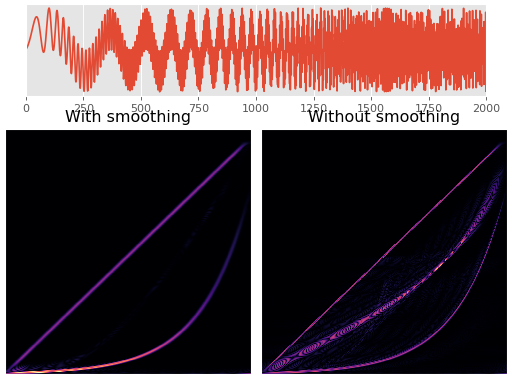
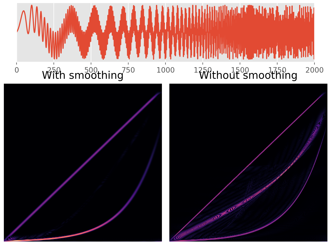
Wigner-Ville Smoothing
One of the main disadvantages of the Wigner-Ville method is occurrence of interference terms. This can be somewhat alleviated by smoothing it at the cost of the clarity of the distribution.
The following plot shows an example of this behaviour. The signal consists of a linear chirp and an exponential chirp. The left figure is with smoothing and the right one without it.
(Source code, png, hires.png, pdf)
import matplotlib as mpl
mpl.rcParams['font.size'] = 9.0
import matplotlib.pylab as plt
plt.style.use("ggplot")
from mtspec import wigner_ville_spectrum
from mtspec.util import linear_chirp, exponential_chirp
import numpy as np

fig = plt.figure()
data = linear_chirp() + exponential_chirp()

# Plot the data
ax1 = fig.add_axes([0.05,0.75, 0.90, 0.24])
ax1.plot(data)
ax1.set_xlim(0, len(data))
ax1.set_yticks([])

# Get the smoothed WV spectrum.
wv = wigner_ville_spectrum(data, 10, 5.0, smoothing_filter='gauss',
                           filter_width=25)

# Plot the WV
ax2 = fig.add_axes([0.01, 0.025, 0.48, 0.64])
ax2.set_yticks([])
ax2.set_xticks([])
ax2.imshow(abs(wv), interpolation='nearest', aspect='auto',
           cmap="magma")
ax2.set_title('With smoothing')

# Get the WV spectrum.
wv = wigner_ville_spectrum(data, 10, 5.0, smoothing_filter=None)

# Plot the WV
ax3 = fig.add_axes([0.51, 0.025, 0.48, 0.64])
ax3.set_yticks([])
ax3.set_xticks([])
ax3.imshow(abs(wv), interpolation='nearest', aspect='auto',
           cmap="magma")
ax3.set_title('Without smoothing')

plt.show()
Multitaper coherence example
Calculate the coherency of two signals using multitapers. Function
documentation: mtspec.multitaper.mt_coherence().
import matplotlib.pyplot as plt
plt.style.use("ggplot")

from mtspec import mt_coherence
import numpy as np

# generate random series with 1Hz sinus inside
np.random.seed(815)
npts = 256
sampling_rate = 10.0
# one sine wave in one second (sampling_rate samples)
one_hz_sin = np.sin(np.arange(0, sampling_rate) / \
                    sampling_rate * 2 * np.pi)
one_hz_sin = np.tile(one_hz_sin, npts // sampling_rate + 1)[:npts]
xi = np.random.randn(npts) + one_hz_sin
xj = np.random.randn(npts) + one_hz_sin
dt, tbp, kspec, nf, p = 1.0/sampling_rate, 3.5, 5, npts/2, .90

# calculate coherency
out = mt_coherence(dt, xi, xj, tbp, kspec, nf, p, freq=True,
                   cohe=True, iadapt=1)

# the plotting part
plt.subplot(211)
plt.plot(np.arange(npts)/sampling_rate, xi)
plt.plot(np.arange(npts)/sampling_rate, xj)
plt.xlabel("Time [sec]")
plt.ylabel("Amplitude")
plt.subplot(212)
plt.plot(out['freq'], out['cohe'])
plt.xlabel("Frequency [Hz]")
plt.ylabel("Coherency")

plt.tight_layout()
plt.show()
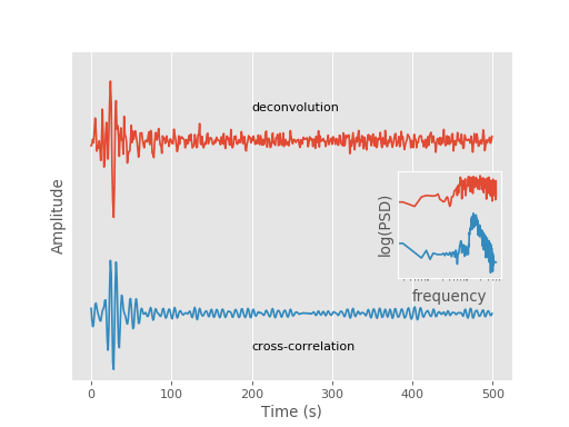
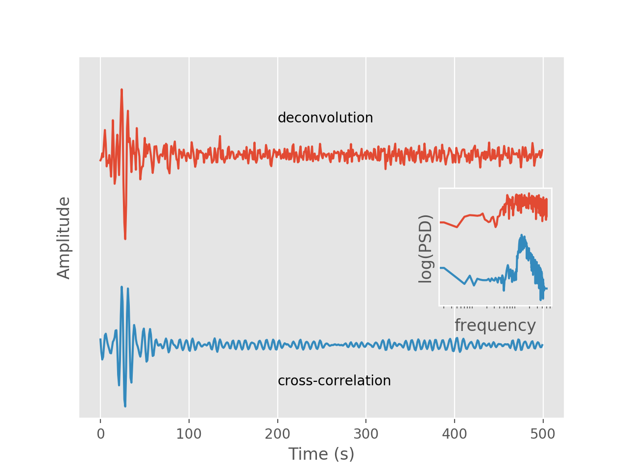
Fig. 6: Deconvolution
Demonstrates the deconvolution of two time series. See the
mtspec.multitaper.mt_deconvolve() function for details.
(Source code, png, hires.png, pdf)

import matplotlib.pyplot as plt
import numpy as np
import scipy.fftpack

from mtspec import mt_deconvolve, mtspec
from mtspec.util import _load_mtdata

plt.style.use("ggplot")

# Load and demean data.
pasc = _load_mtdata('PASC.dat.gz')
ado = _load_mtdata('ADO.dat.gz')
pasc -= pasc.mean()
ado -= ado.mean()

r = mt_deconvolve(pasc, ado, delta=1.0,
                  time_bandwidth=4.0,
                  number_of_tapers=7,
                  nfft=len(pasc), demean=True,
                  weights="adaptive")

deconvolved = r["deconvolved"]

Pdeconv = deconvolved[-500:][::-1]
Pdeconv /= Pdeconv.max()

nfft = 2 * len(pasc)
pasc = scipy.fftpack.fft(pasc, n=nfft)
ado = scipy.fftpack.fft(ado, n=nfft)
cc = pasc * ado.conj()

cc = scipy.fftpack.ifft(cc).real
Pcc = cc[-500:][::-1]
Pcc /= Pcc.max()


Dspec, Dfreq = mtspec(Pdeconv, delta=1.0,
                      time_bandwidth=1.5,
                      number_of_tapers=1)
Cspec, Cfreq = mtspec(Pcc, delta=1.0,
                      time_bandwidth=1.5,
                      number_of_tapers=1)

# Plotting
plt.plot(np.arange(0, 500), Pdeconv + 3)
plt.annotate("deconvolution", (200, 3.5))
plt.plot(np.arange(0, 500), Pcc)
plt.annotate("cross-correlation", (200, -0.5))

plt.ylim(-1, 4.5)
plt.yticks([], [])
plt.xlabel("Time (s)")
plt.ylabel("Amplitude")

inset = plt.axes([0.7, 0.35, 0.18, 0.25])
plt.loglog(Dfreq, Dspec*1e5)
plt.loglog(Cfreq, Cspec)
plt.ylabel("log(PSD)")
plt.xlabel("frequency")
plt.yticks([], [])
plt.setp(inset, xticks=[])

plt.show()
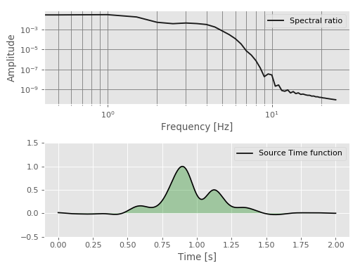
Multitaper deconvolution for earthquake source studies
This example shows how to compute the relative source time function of a target
event using the empirical Green’s function approach with the
mt_deconvolve() function.
It utilizes the ObsPy library to read and filter the
seismological example data but it is not required for using mtspec.
(Source code, png, hires.png, pdf)

import numpy as np
import matplotlib.pyplot as plt
import obspy
from obspy.signal.filter import lowpass

from mtspec import mt_deconvolve, mtspec

plt.style.use('ggplot')

# Read the data
main_data = obspy.read('data/main.sac')[0]
egf = obspy.read('data/egf.sac')[0]

sr = main_data.stats.sampling_rate
dt = 1.0 / sr

r = mt_deconvolve(main_data.data, egf.data, dt,
                  nfft=main_data.stats.npts,
                  time_bandwidth=4, number_of_tapers=7,
                  weights='constant', demean=True)

decon = r['deconvolved']
freq = r['frequencies']

# Time vector for RSTF.
time = np.arange(0, len(decon))*dt

M = np.arange(0, len(decon))
N = len(M)

SeD = np.where(np.logical_and(M >= 0, M <= N / 2))
d1 = decon[SeD]

SeD2 = np.where(np.logical_and(M > N / 2, M <= N + 1))
d2 = decon[SeD2]

# Relative source time function
stf = np.concatenate((d2, d1))

# Cleaning the rSTF from high frequency noise
stf = lowpass(stf, 4, sr, corners=4, zerophase=True)
stf /= stf.max()

# Fourier Transform of the rSTF
Cspec, Cfreq = mtspec(stf, delta=dt, time_bandwidth=2,
                      number_of_tapers=3)

m = len(Cspec)
Cspec = Cspec[:m // 2]
Cfreq = Cfreq[:m // 2]

# Creating figure
fig = plt.figure()
ax1 = fig.add_subplot(211)
ax1.loglog(Cfreq, Cspec, '0.1', linewidth=1.7,
           label='Spectral ratio')
ax1.set_xlabel("Frequency [Hz]")
ax1.set_ylabel("Amplitude")
plt.grid(True, which="both", ls="-", color='grey')
plt.legend()

ax2 = fig.add_subplot(212)
ax2.plot(time, stf, 'k', linewidth=1.5,
         label='Source Time function')
ax2.fill_between(time, stf, facecolor='green', alpha=0.3)
ax2.set_xlabel("Time [s]")
ax2.set_ylim(-0.5, 1.5)

plt.legend()
plt.tight_layout()

plt.show()
